Client
Non-profit
Role
Art Director, Lead Designer
Contribution
New Brand Identity, Typeface Design, Launch Campaign Development, Brand Video, Brand in Action
The Greater Chicago Food Depository is one of the most well-established and impactful nonprofit organizations in the nation. Year after year, the Food Depository works toward one ultimate goal: ending hunger in our community. But the Food Depository does more than just that. With a wide range of programs, teams of passionate people, and devoted volunteers, the Food Depository is also helping those in need through job training and professional development.
In order to better convey the full breadth of its mission, the Greater Chicago Food Depository was looking for an opportunity to refresh their brand. We worked with them at every step, from strategic planning and messaging to a full-on rebranding. A new logo was created for the Greater Chicago Food Depository—a logo that represented renewed energy, growth, and hope.
Brand Video 02:00 (2019)
Team / 88 Brand Partners, BMP Film Co.
My Contribution / Storyboard Development, Graphic Design, On-site Art Direction
nourish: A Bespoke Typeface
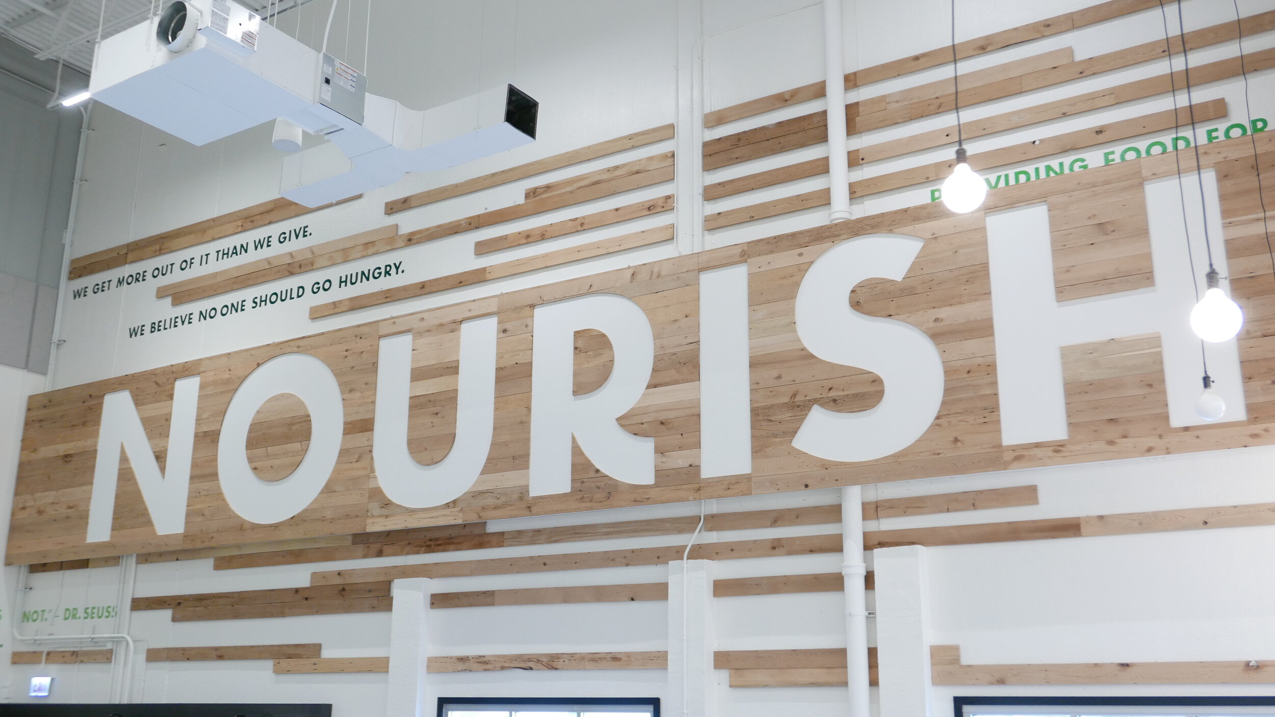
To create a sense of ownership for the brand, I designed a custom font, called Nourish—an alternative typeface based on Futura, with curvy legs and low crossbars that lend a friendly, organic feel. It reinforces the brand voice with a strong and unique visual language.
The Food Depository had 40 years of equity built into its heritage color, a dark green, which we kept while enlivening the brand with new bright colors. This palette is inspired by fresh produce, creating a positive association and energy for the community.
Building A Greater Chicago
From the renovated volunteer center to food pantries, events, and new programs, the fresh brand identity for the Greater Chicago Food Depository continues to grow and take deeper root across many Chicago neighborhoods. The impact of the Food Depository on our community is the most fulfilling example of how a rebrand can empower a great organization.
88 Brand Partners
Client / Greater Chicago Food Depository
Project Phase / Production, 2018–2019
Executive Creative Director / Joe Popa
Associate Creative Director / Terry Boyd
Senior Developer / Brian Travers
Art Director / Danielle Chen, Anne Flavin
back to WORK
or see other projects
Branding / Digital / Advertising / Packaging


